A studio built on pop culture, rock and roll, good vibes and a ton of humor. Specialising in graphic design, brand identity & creating content which your old man wouldn’t understand.
In what we do, we don’t see rules — only possibilities. Our creativity allows for endless opportunity when done right, which makes us exactly the type of creative influence you were looking for without knowing it.
As a small studio with a worldwide attitude we are always searching for the right balance between challenging and fun projects. Got one? Shoot us a message!
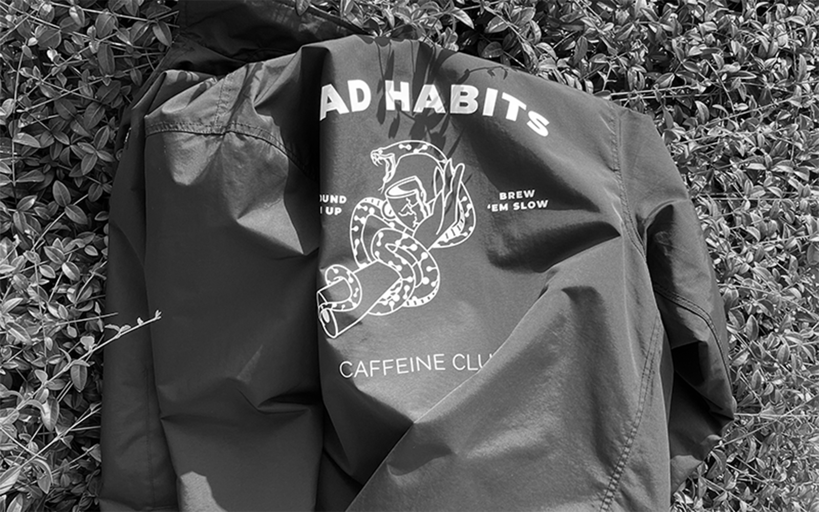
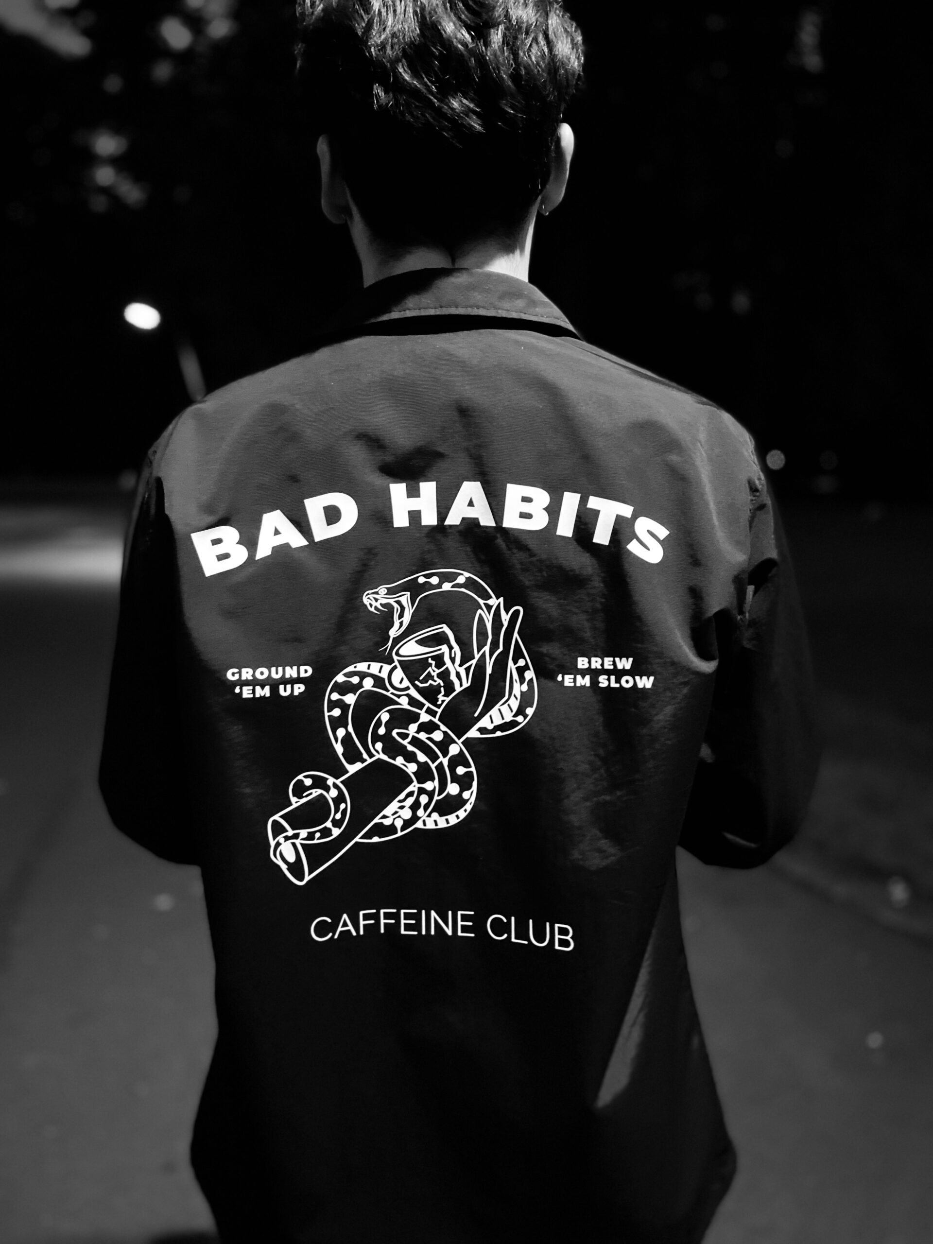
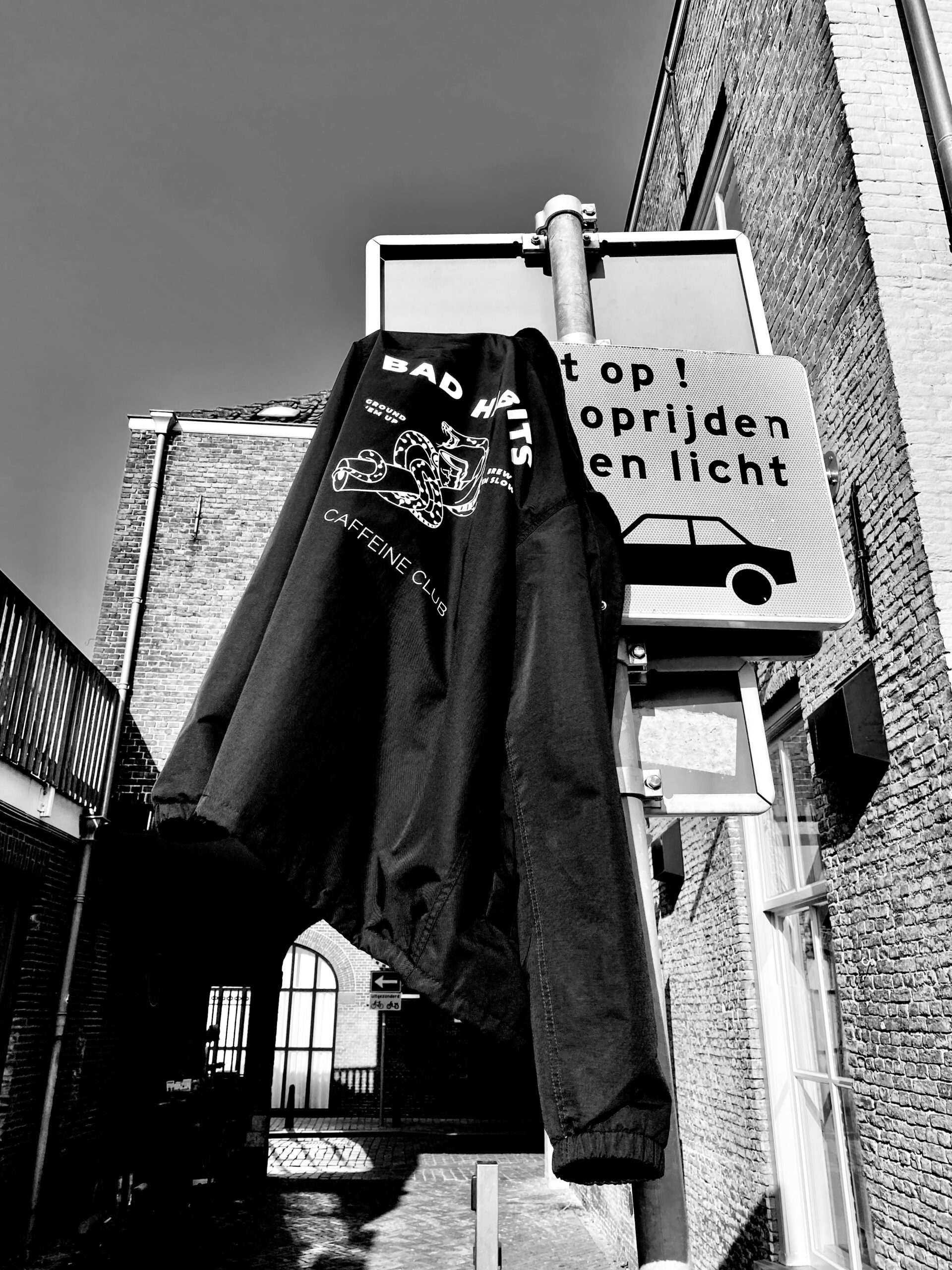
What you gotta do when you work in one of the best coffee places in Breda (the Netherlands) and autumn is coming? You’re probably gonna need a jacket to keep nice and cozy, maybe even to stay dry who knows with the crazy dutch weather?
You probably don’t want a standard jacket, you want something fun and special and it’s gotta say a little bit about your personality right?
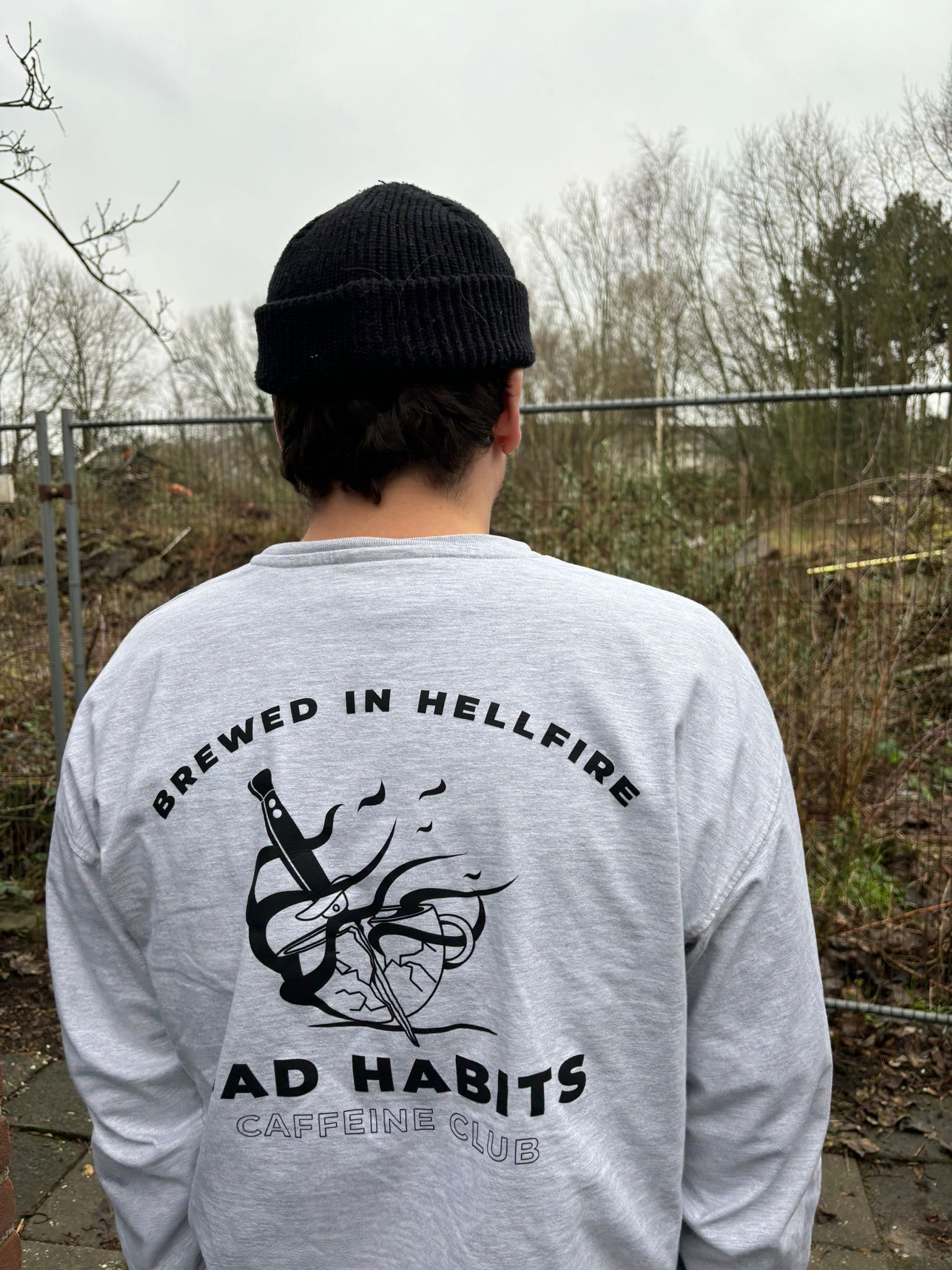
So you start a club. And a club needs some form of distinction on the jacket, don’t you agree?
This is probably what Lodewijk thought when he decided he wanted a new jacket with a custom backprint.
For all you coffee addicts with some bad habits
If you want to join the club, hit the link below and send me a message.
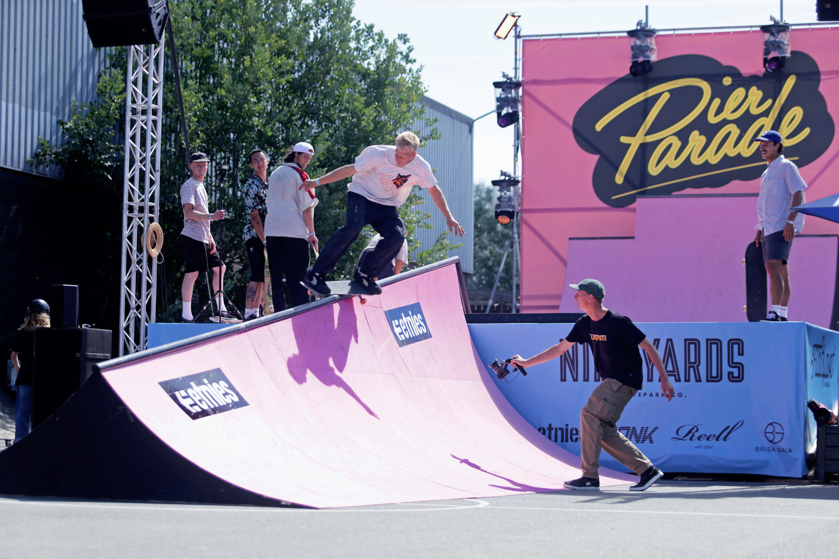
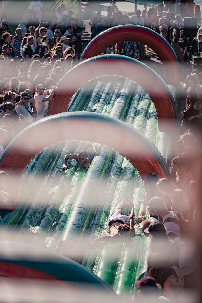
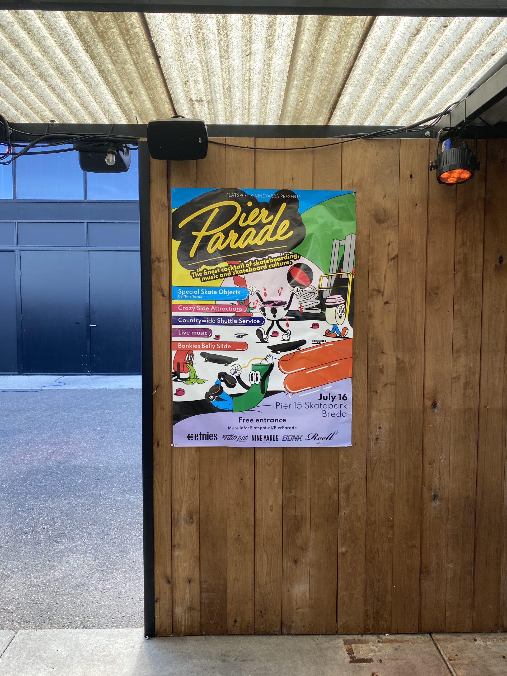
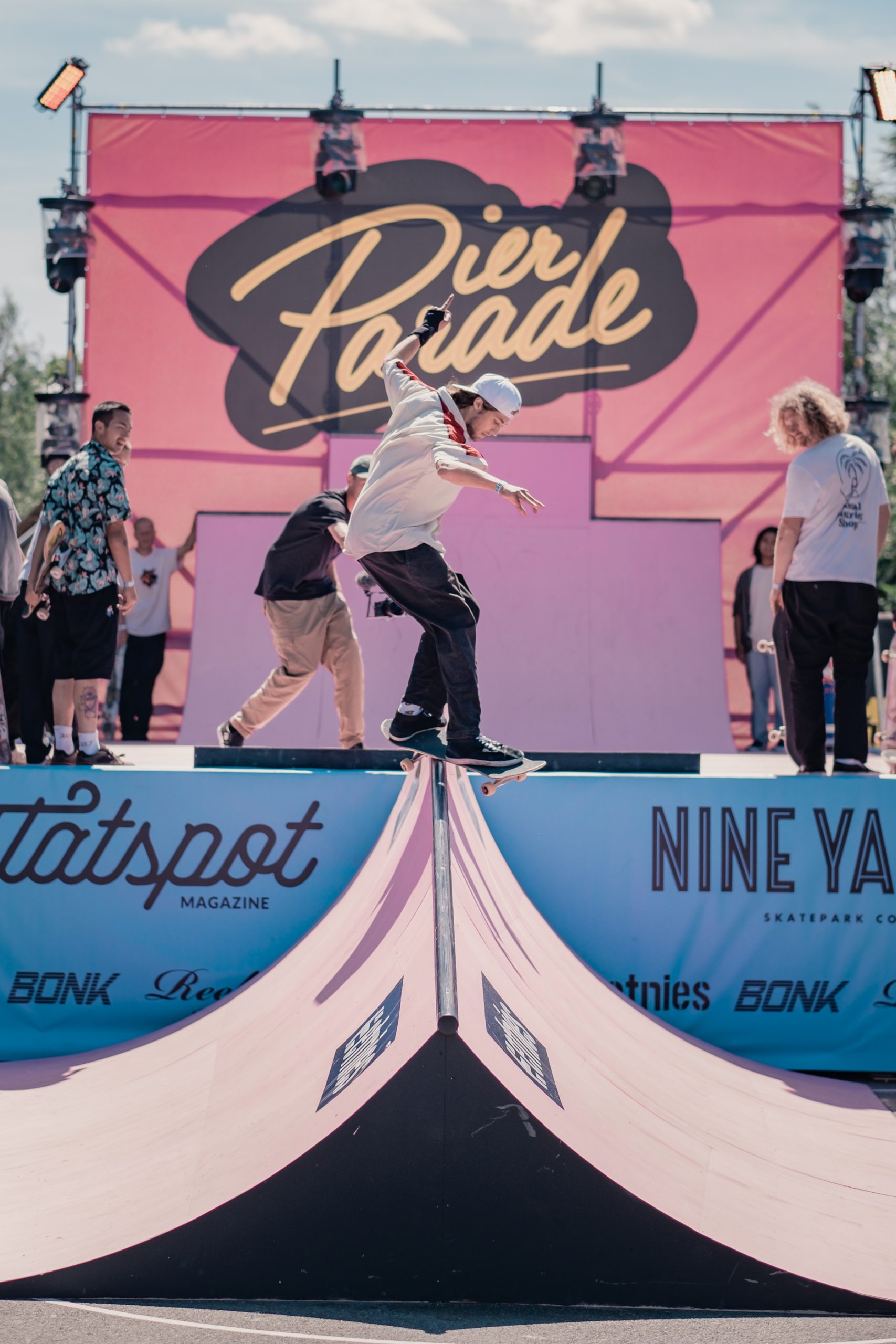
Flatspot magazine, NINE YARDS skateparks and PIER15, decided to host their own festival which for which we designed the first ever branding. The briefing consisted of one sentence: Design total choas fitting for the finest cocktail of skateboarding, music and skateboarding culture called Pier Parade.
Sure thing! Let’s go colourfull, crazy and a little bit weird right? The design perfectly blends the total chaos that would ensue on the PierParade festival terrain, and still looks sleek.
The festival itself was a succes thanks to 30+ degrees, sun, sick tricks, madness, and Bokies Beerslide.
Words cannot describe the madness of the event but the chaos of the imagery was a perfect fit for it.
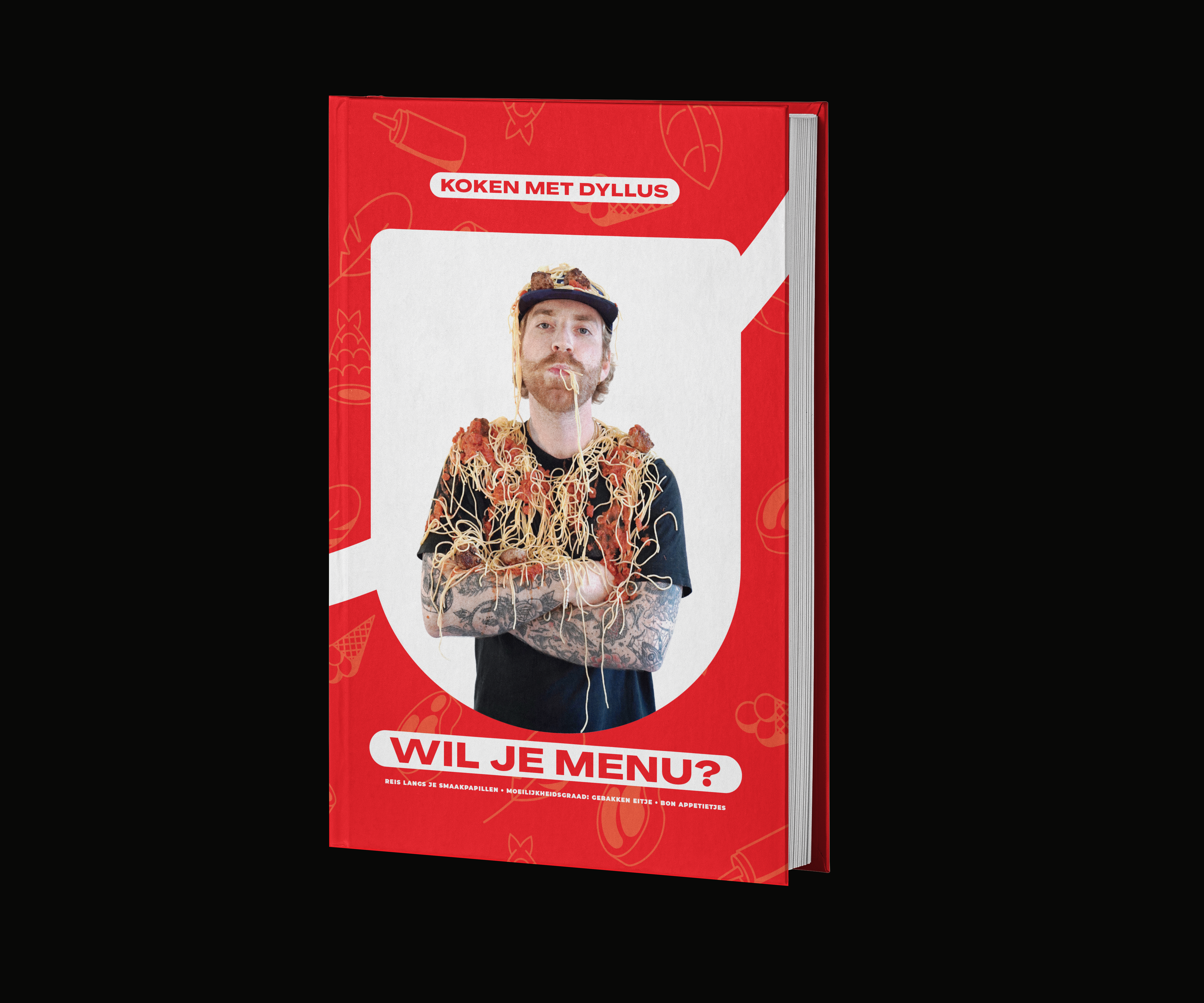
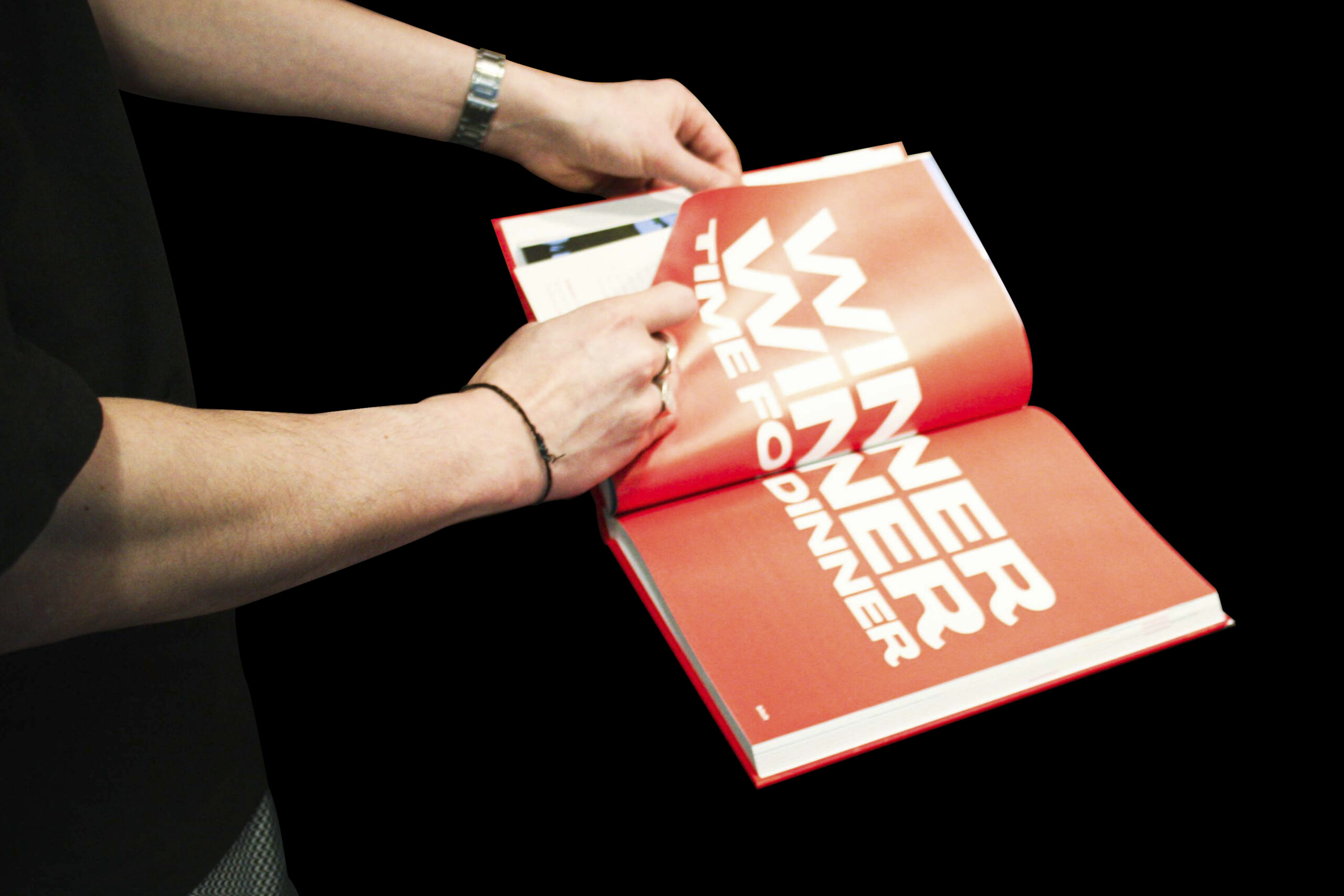
In Wil je menu? Jack Dylan Priem takes you by the hand to make sure that even you as a gigantic disaster in the kitchen will be able to make some tasty dishes.
We filled this cookbook with recipes that anyone who know how to read can make by themself. In addition to that we even added some ready-to-use menu’s you can use to surpirse your tinderdate or your friends.
Or how about the delicious anti-hangover lunches you need ‘cause you’ve been drinking like a dockworker the night before? Dylan helps you out with a delicious, sturdy lunch packed with flavour and an lil’ angel on your tongue.
Every recipe makes you wonder: “fuck, why haven’t I put somepots and pans on the furnace and started cooking earlier?”
This cookbook is packed with recipes even the worst home-chef could make without burning down the house.
In summary the best, and one of the easiest cookbooks around, and since we’re dutch, it not expensive!
Order it via the link below:
Start cookin’!



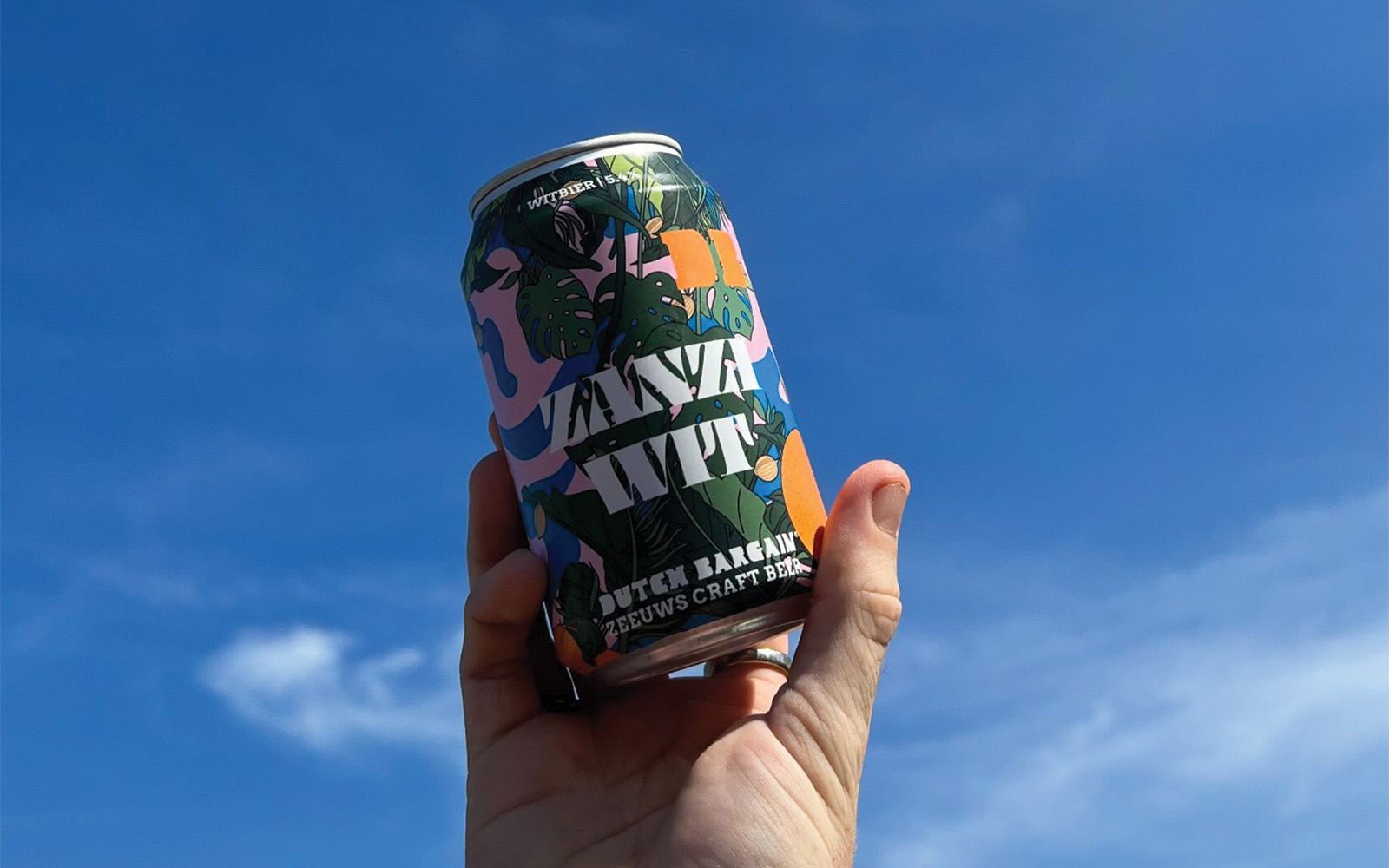
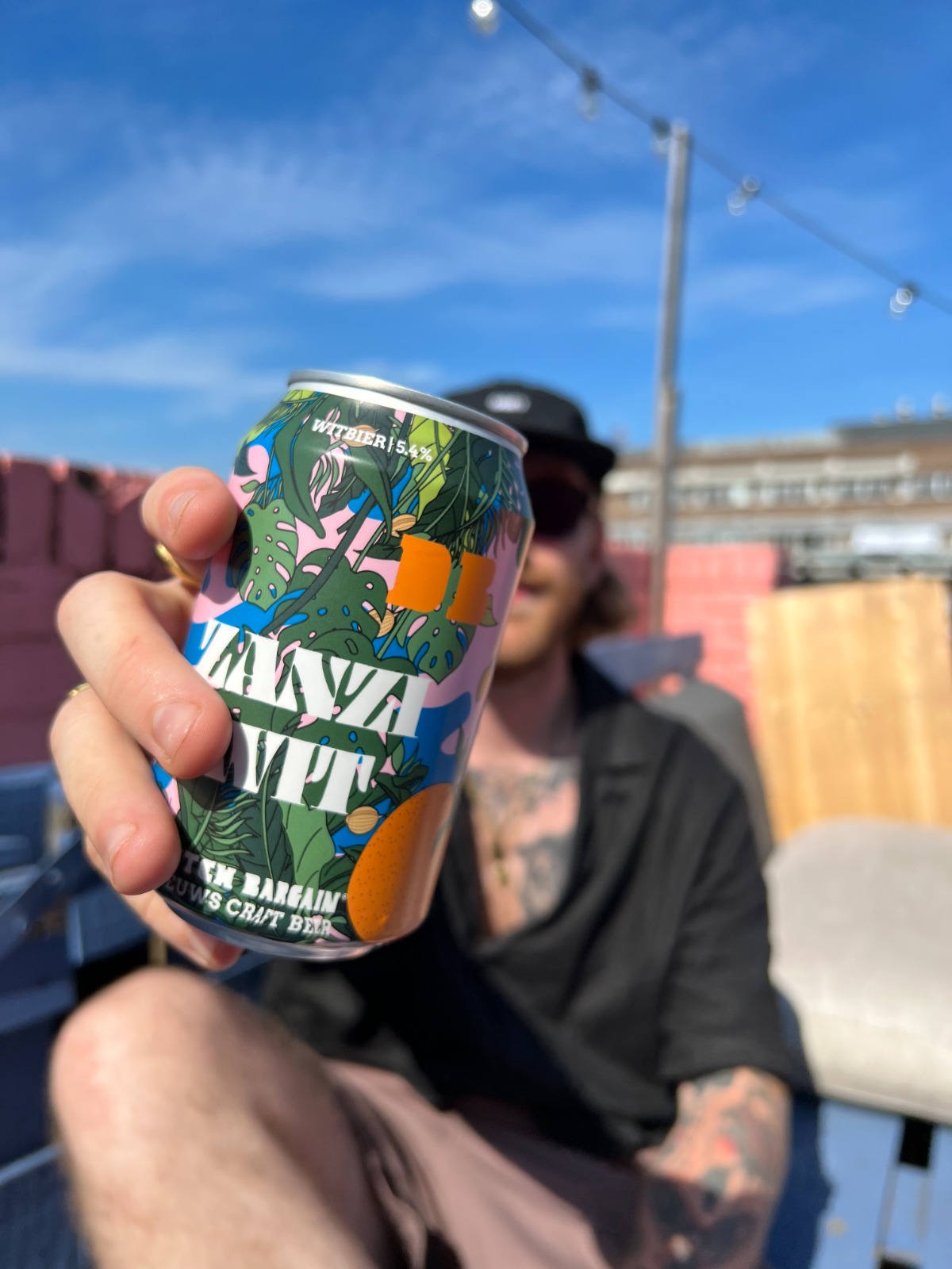
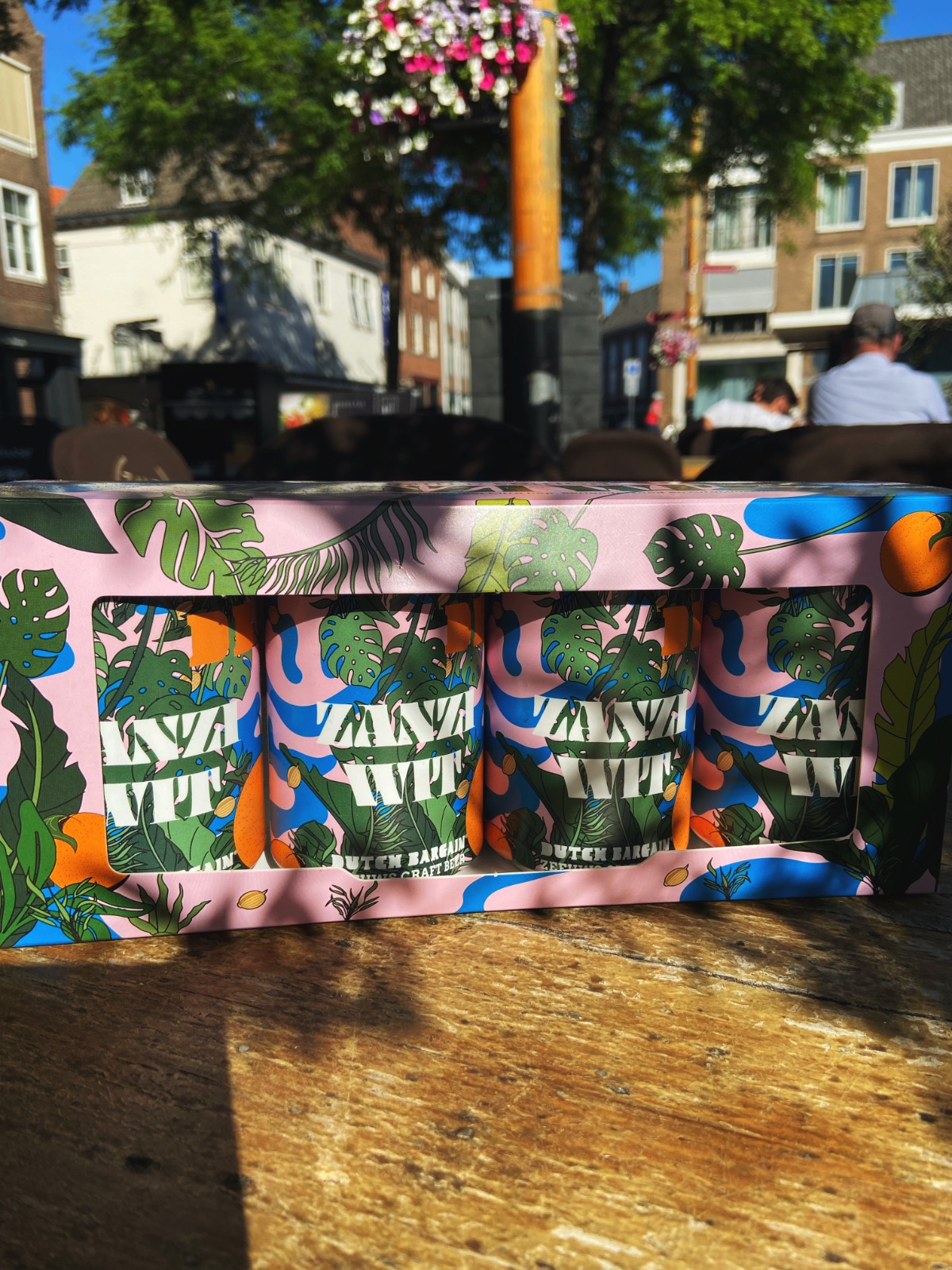
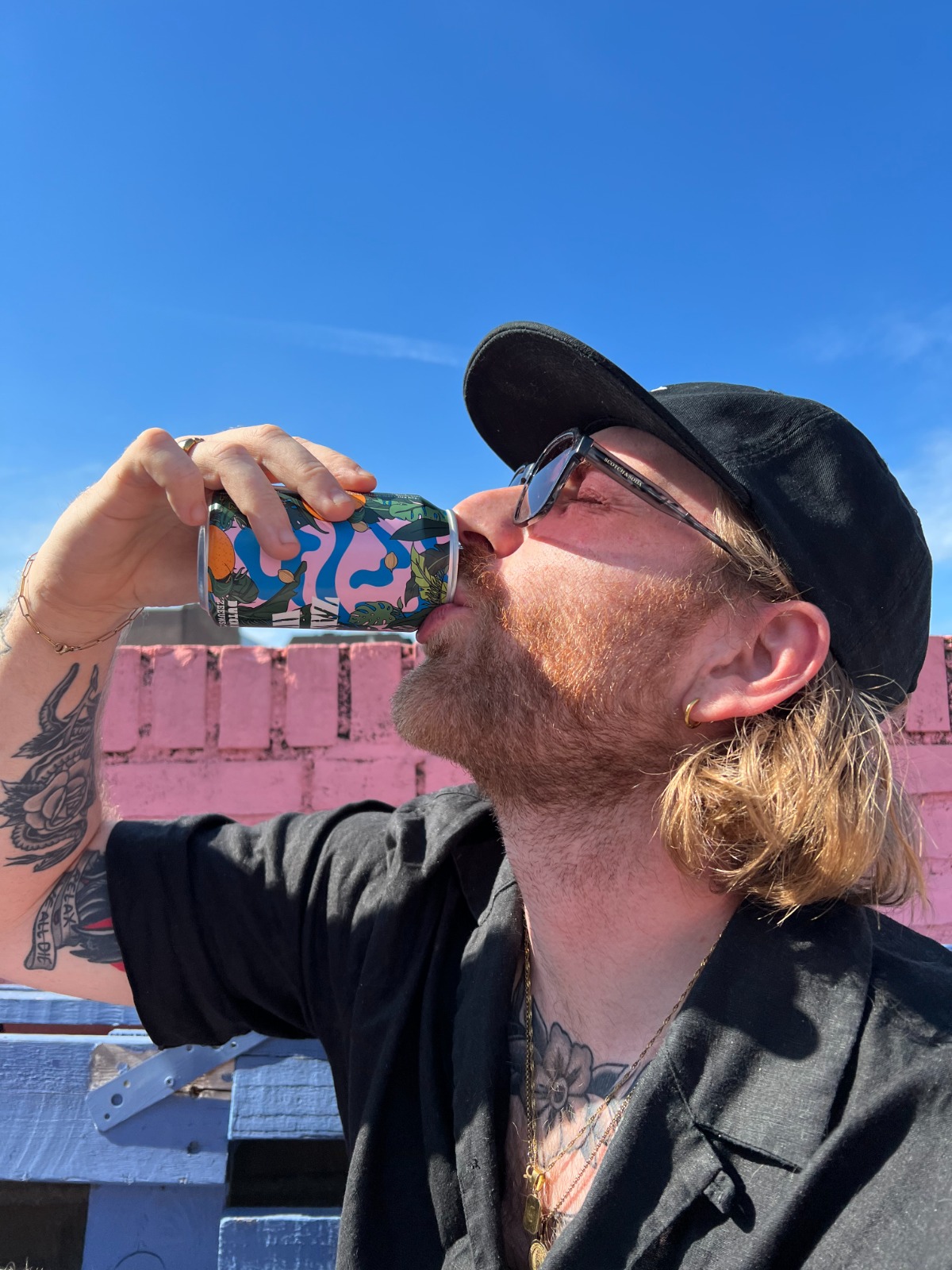
Because he likes beer a lot, Dylan asked Forevernever to design a sleeve for the collaboration-beer between Dutch Bargain and Zanzibar. A super exclusive beer meaning that it would only be sold at the Zanzibar in Middelburg.
It should reflect the style of the Zanzibar, which meant a lot of tropical leaves and plants, some ingrediënts, and a blast of colour.
It would get sold in a four-pack with some stickers as a goodie in the four-pack, so maybe we could design these as well?
Hell yes! We love beer, we love colour, we love stickers, and we love designing these kinda items!
As a bonus we also got a couple of beers, to taste and they were marvelously good!
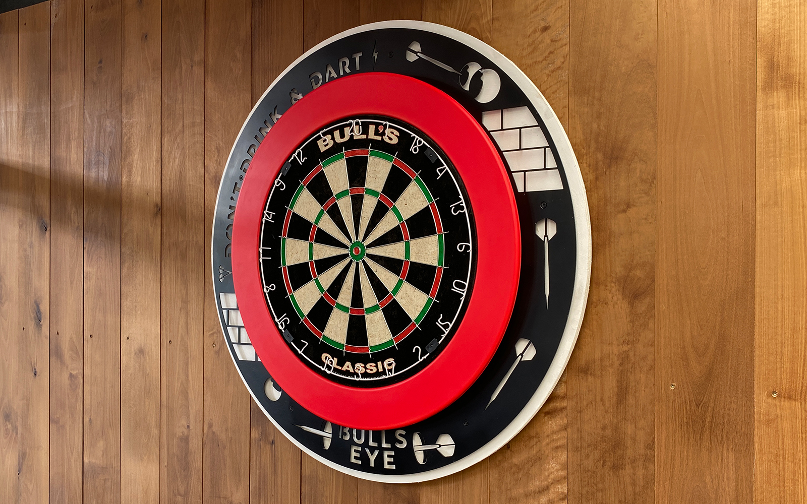
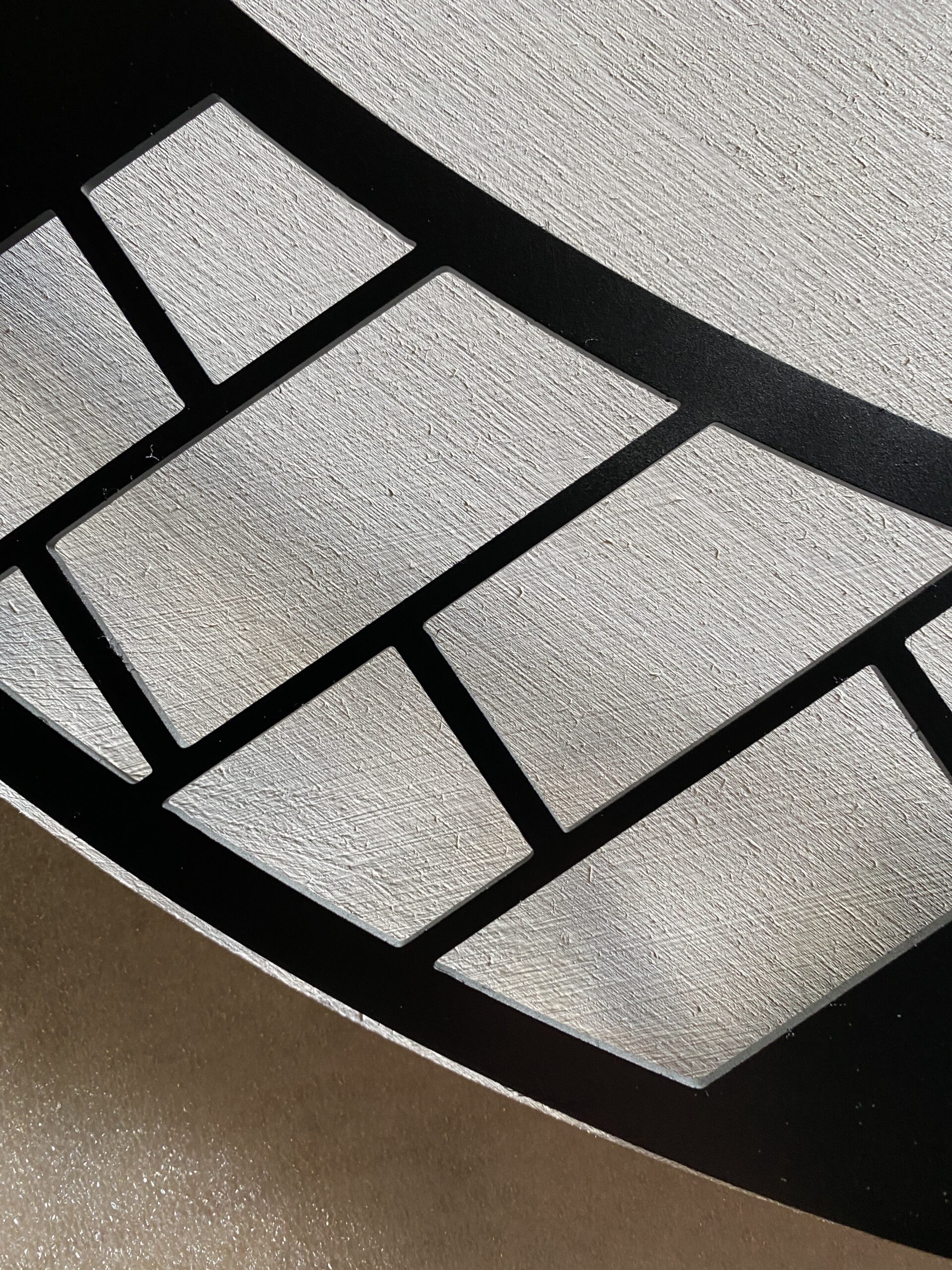
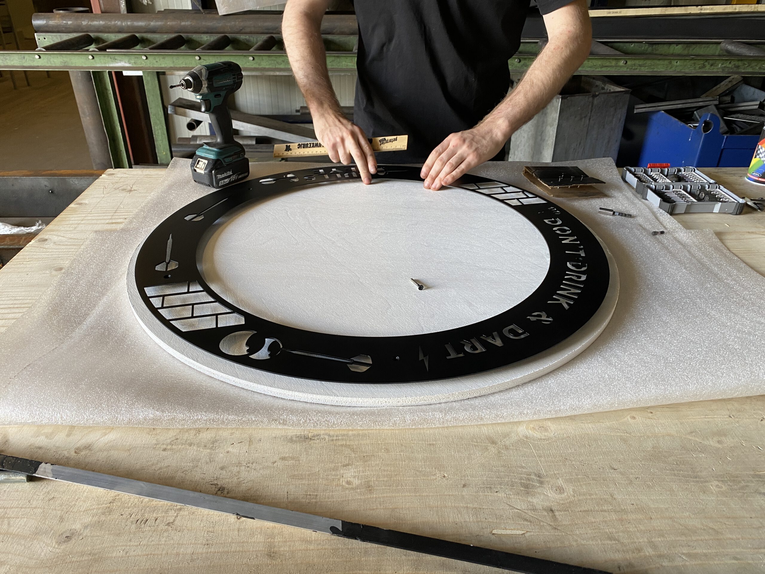
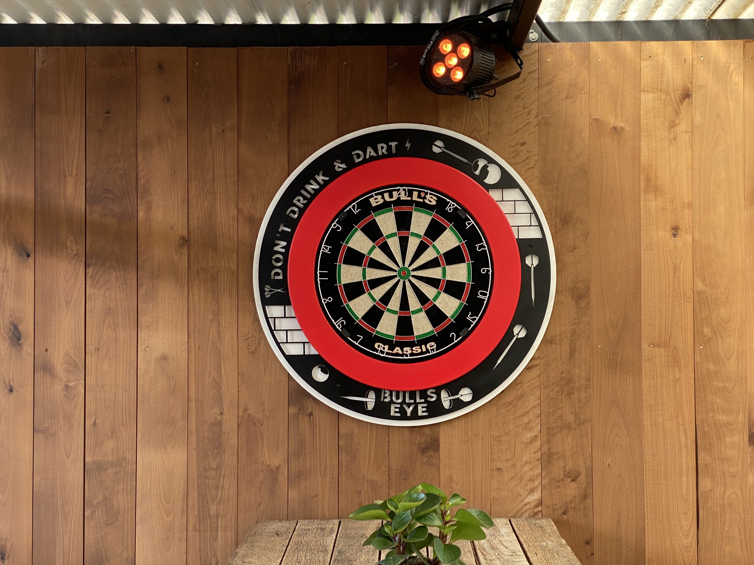
PIER15 asked on facebook if there was anything missing at their skatepark outside hangout – so we yelled out A DARTBOARD!! Not that we’re very good at throwing darts, but still it’s fun to do while drinking some ice-cold beers. One thing led to another and before we knew it, we were making a casing for a dartboard.
We designed the casing around the dartboard surround which is in touch with the skateculture that is PIER15 , and has the right ‘chilling-at-the-bar-drinking-beers-and-want-to-do-something-sporty-but-not-to-sporty vibe.
We added some illustrations in the metal ring to spice it up and give it its own distinction. The text which reads: “Don’t drink and dart” which is self-explanatory. There are to many drunk people darting and hitting friends.
It has its own style yet seamlessly blends in with the PIER15 vibe. Head on over and throw some darts!

Stickers
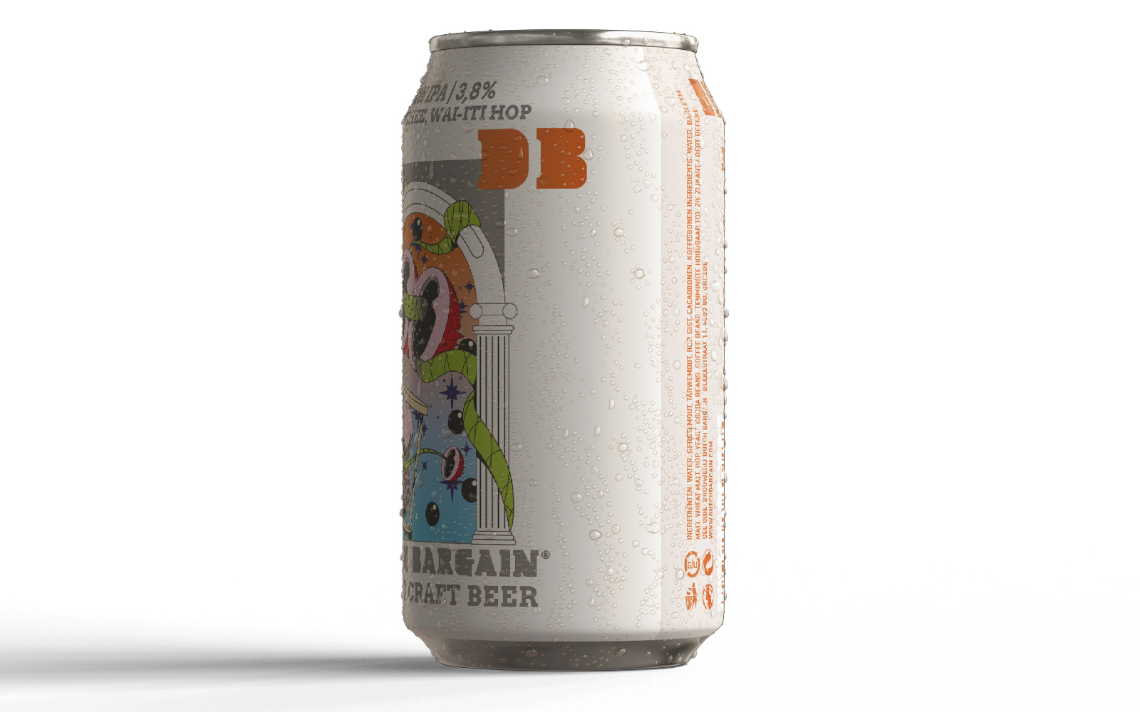
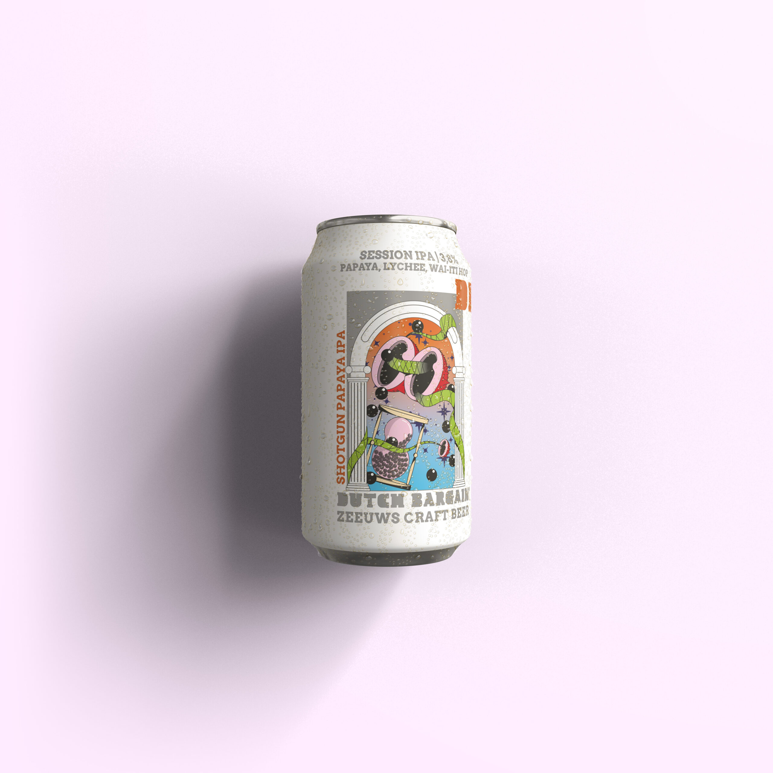
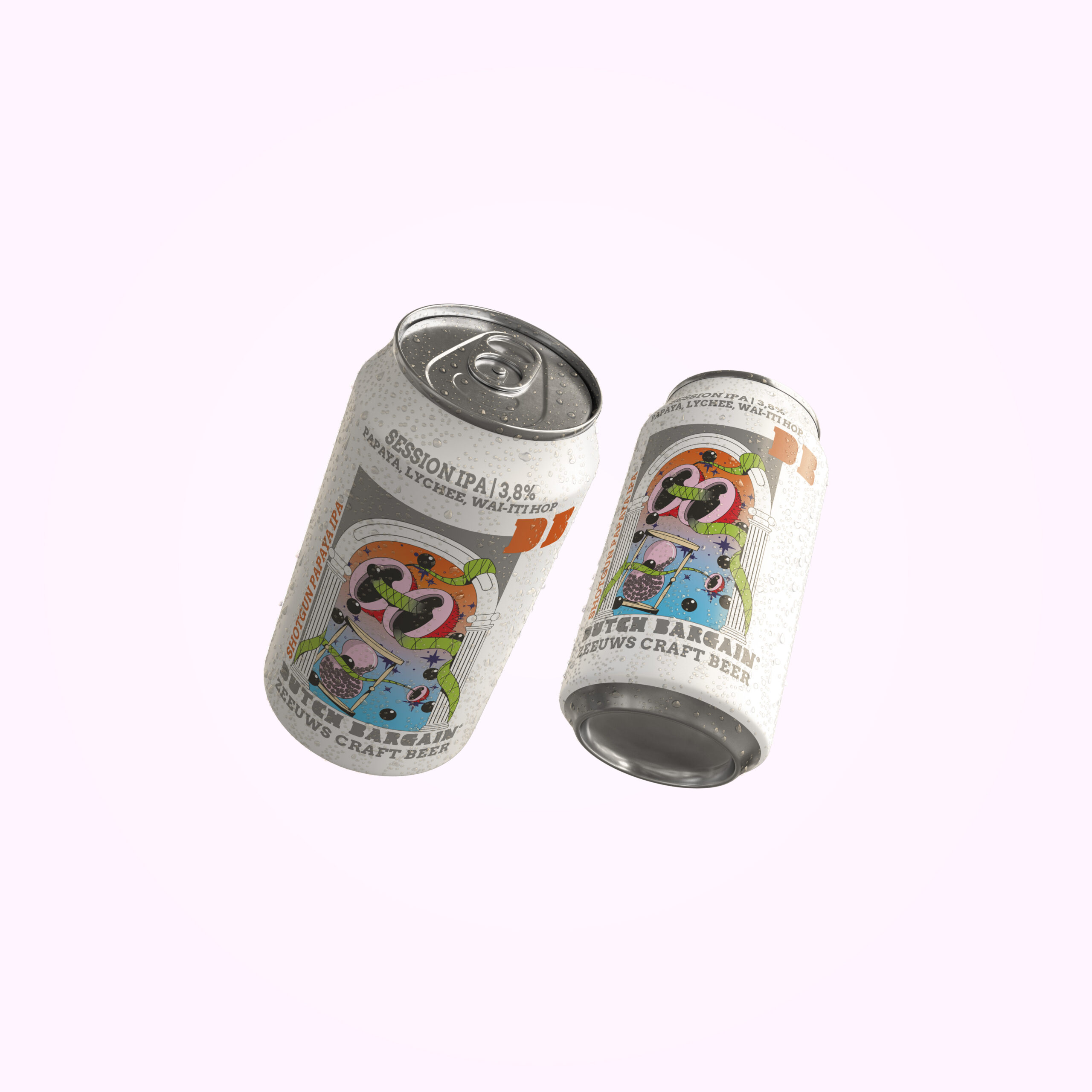
Everyone know we like to party and have some beers at FOREVER NEVER.So when asked to design a beer can, that’s like a dream come true.
When Dutch Bargain (Groede, Zeeland) asked if we would like to design a beer for their signature collection, we could only say yes. When they said we throw in a case of this beer, we were screaming yes!
The design should reflect the name of the beer, a IPA combined with Lychee and Papaya. The name of the beer? Shotgun Papaya IPA.
We extracted the shotgun, and dove into our universum to create an label which truly reflected the fruitiness that’s expected when you have a beer with lychee and papaya.
Welcome to our fruity, extravaganza of flavours universe.

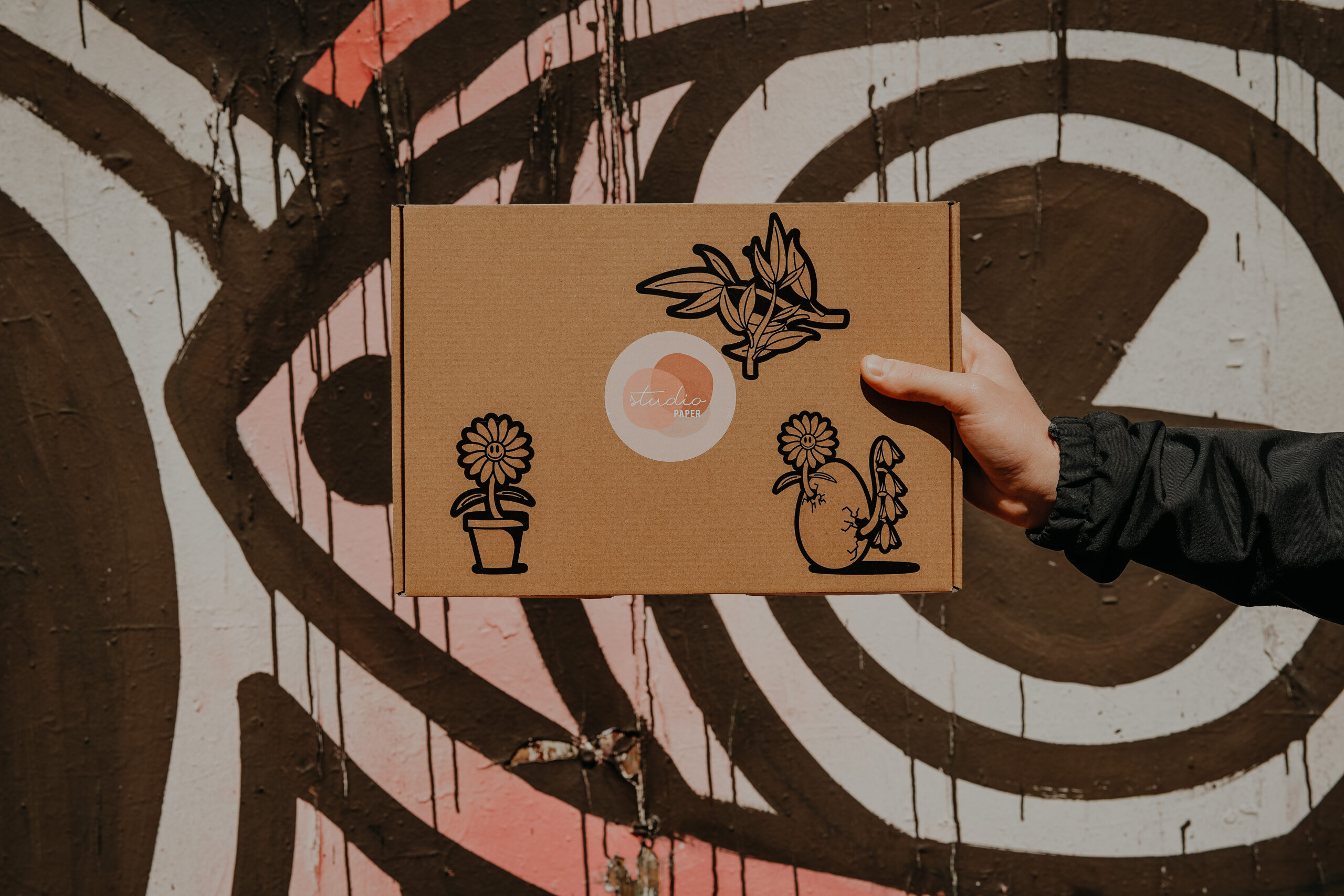
Studio paper releases a box of stationary every month in collaboration with a designer. These boxes vary in items per designer and of course in style of the chosen designer.
In May 2022, Forever Never had a first in combination with Studio Paper. Namely the very first man who was allowed to design a box.
The box had to translate the whole month of May feeling.The feeling of spring and the giddynes that accompanies the spring
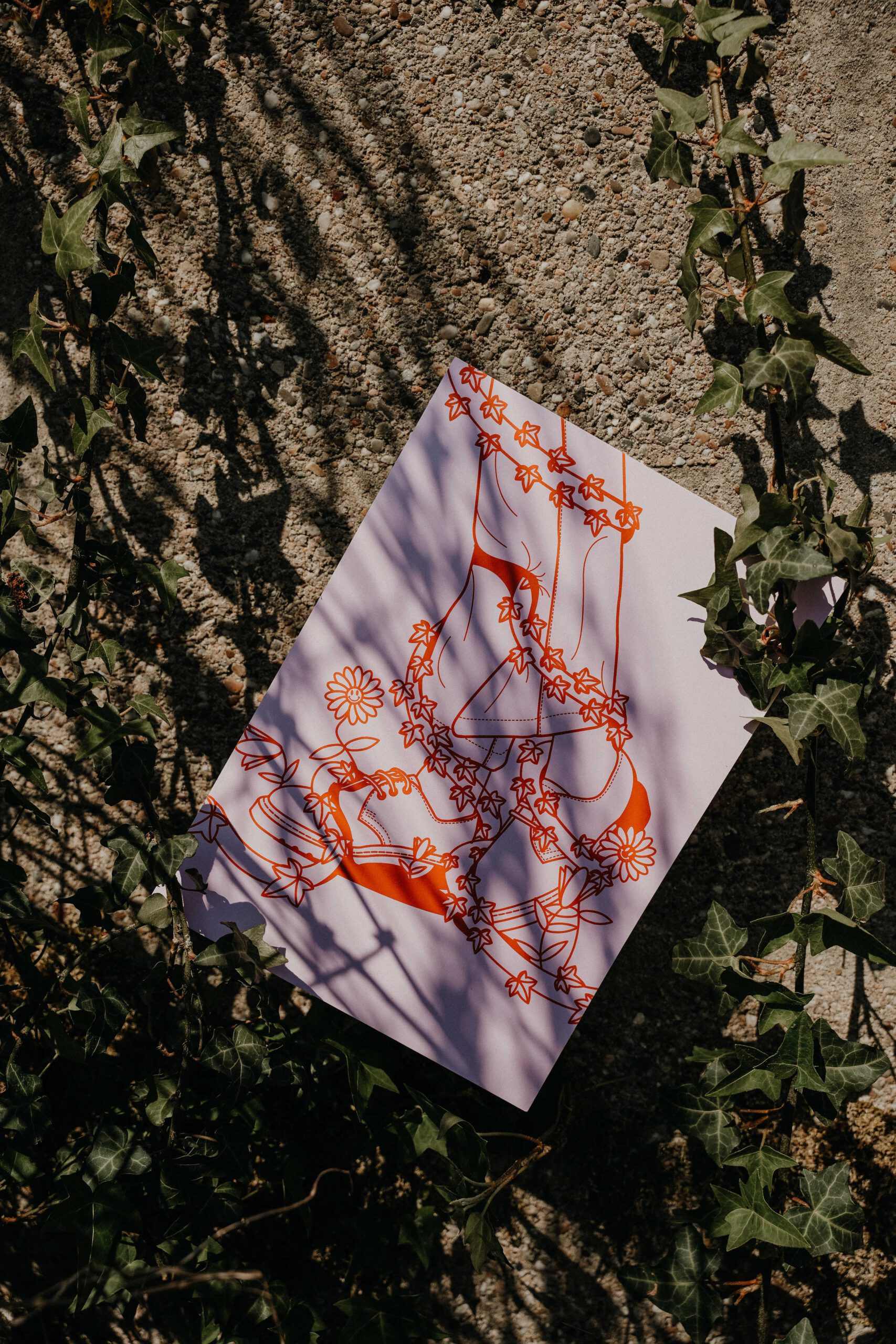
In greece they celebrate may because of the myth of Persephone and Demeter. Persephone emerges from the underworld at the end of each winter, causing her mother Demeter (the goddess of fertility) to overcome with joy, and make all the plants and living things grow and bloom. This translated in Persephone, being hugged by plants since she has finally emerged back from the underworld.
That’s the theme we chose for this box.
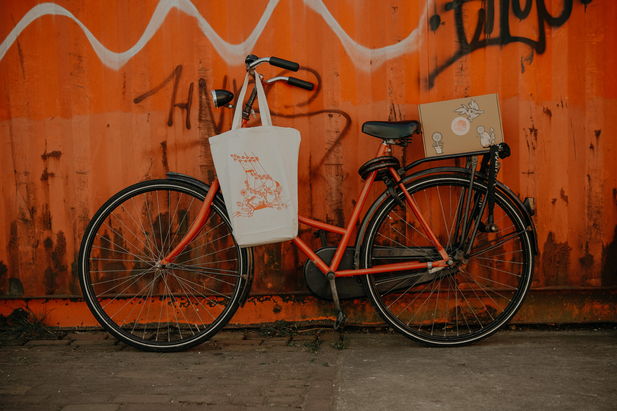
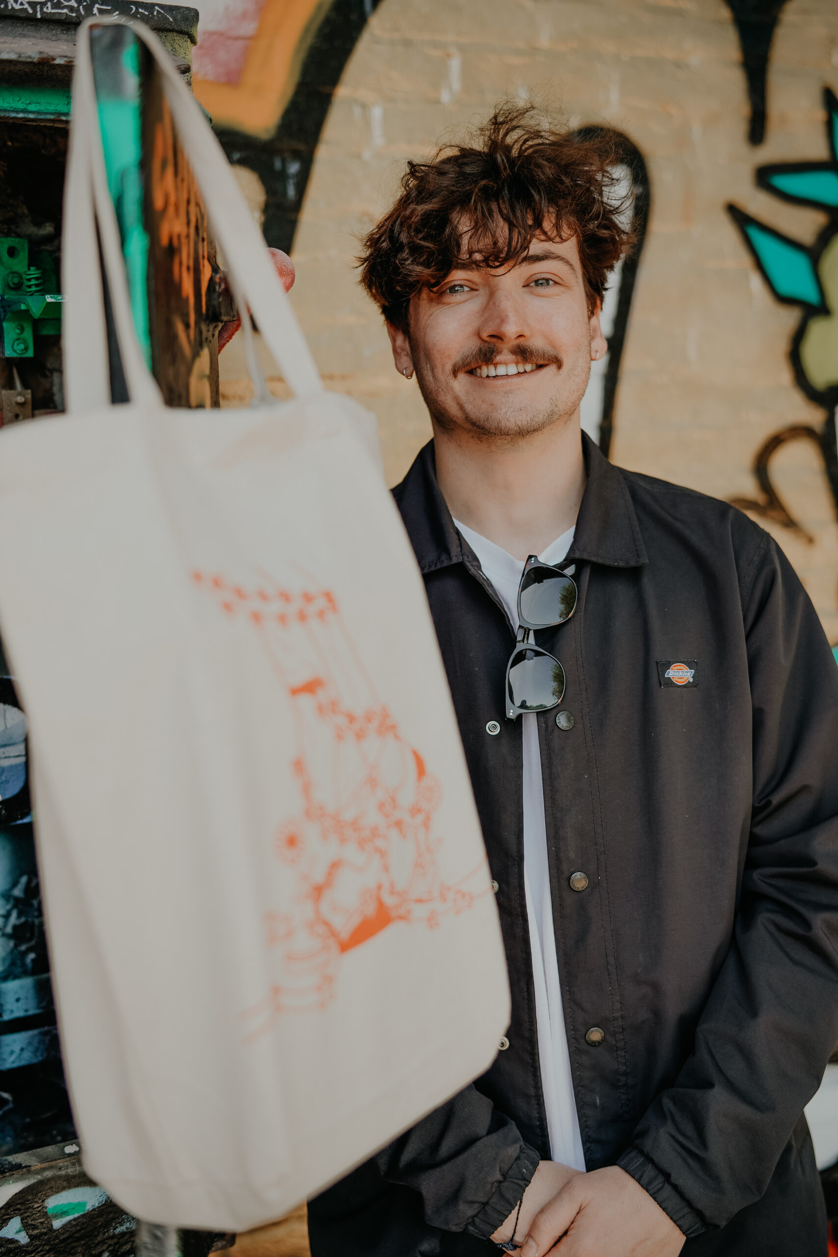
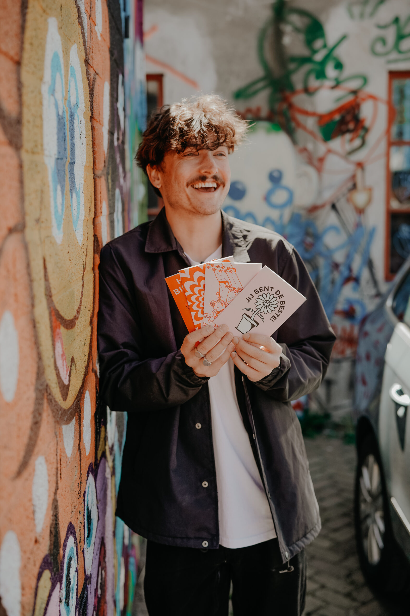
In the box you’ll find a canvas bag, a set of stickers, a set of postcards and a print. All in the theme of Persephone and Demeter.
Check out www.studio-paper.com for all the other boxes and designers. Or to buy our box
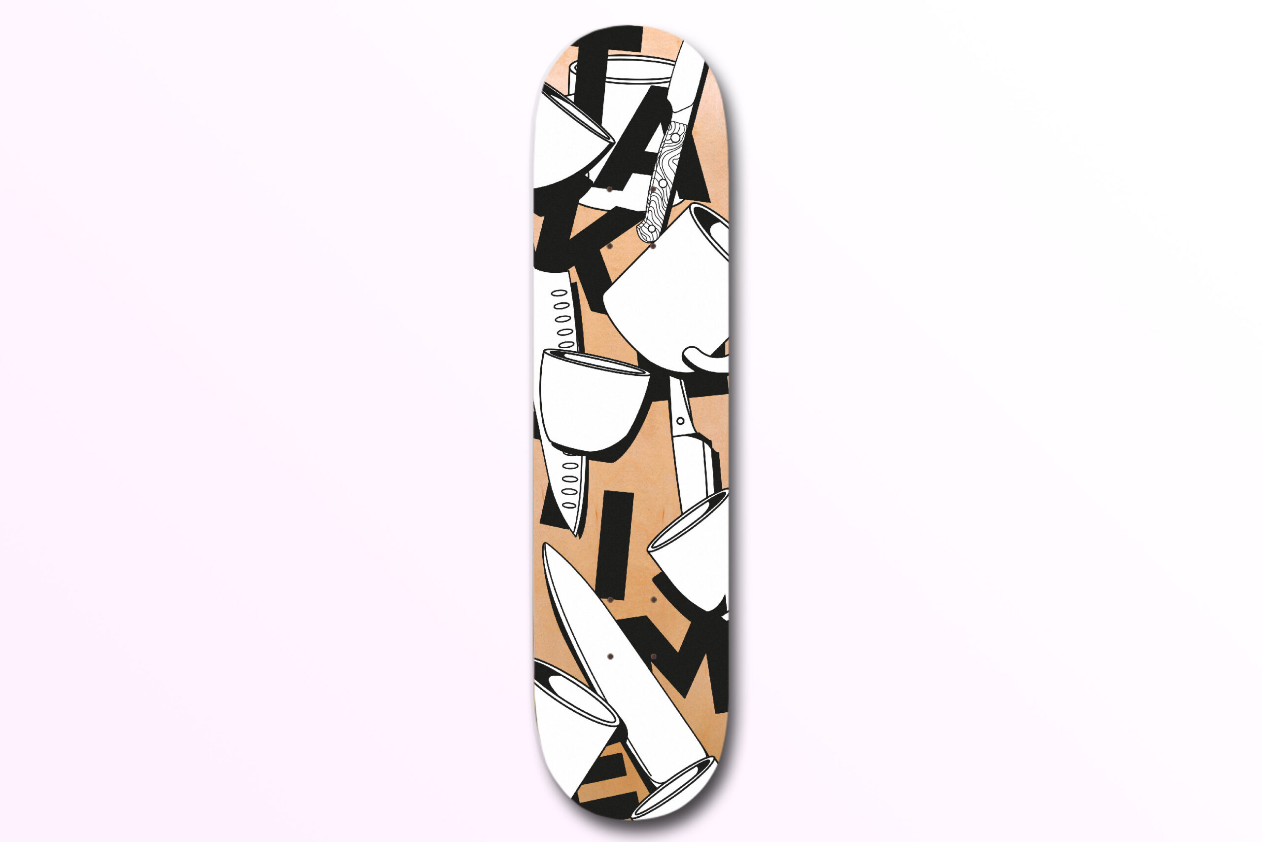
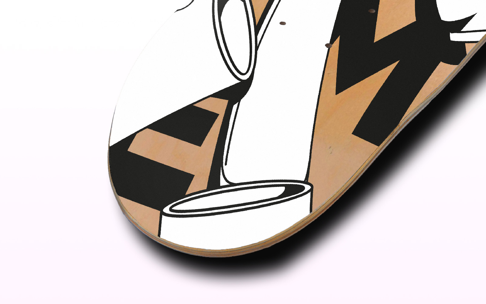
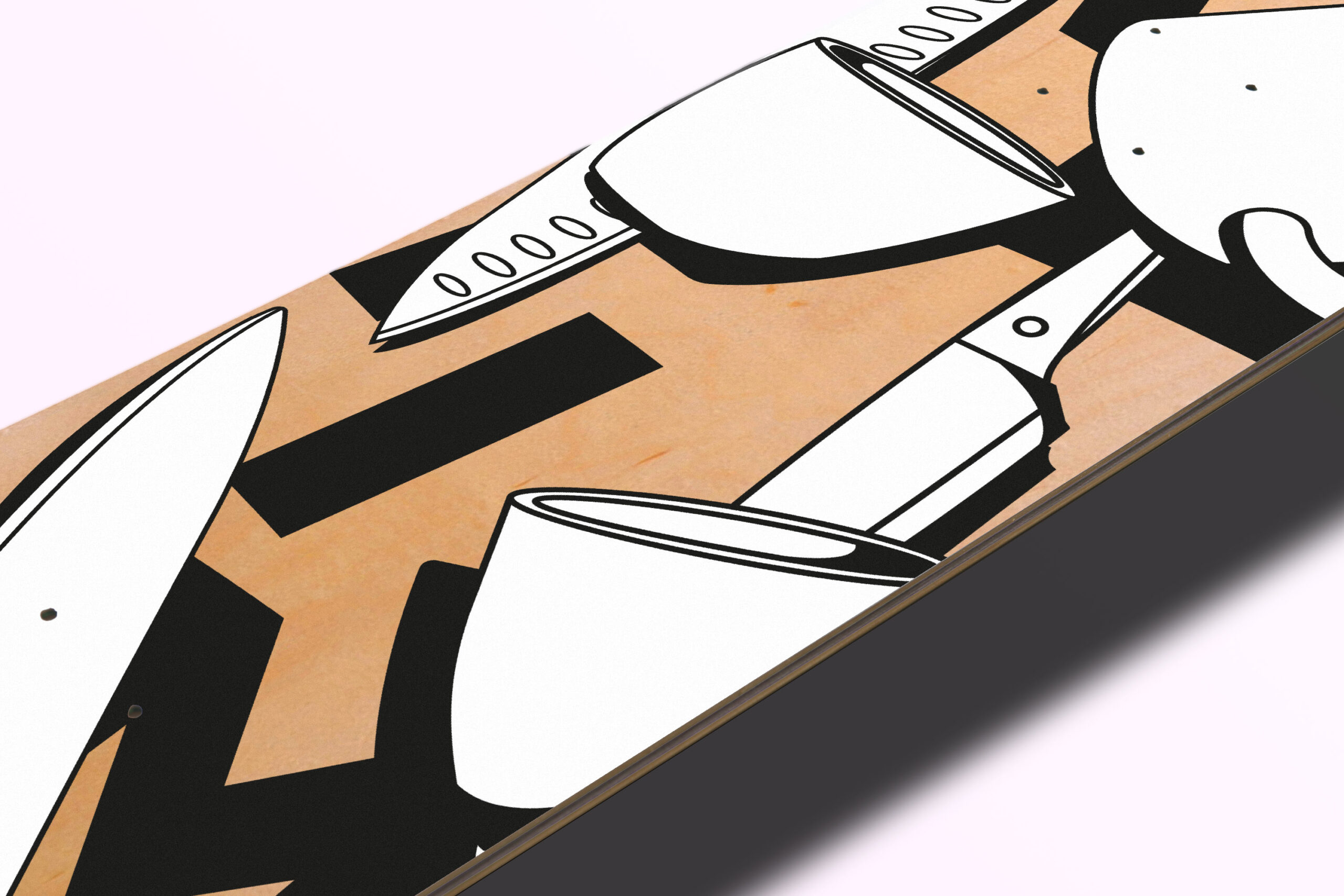
To celebrate the three-year existence of Sip First, we were commisioned by chef Lodewijk to make a custom piece of decoration for in the coffeshop
We were completely free in what it should represent but to have it connect with Sip First, we wanted to show the two pillars on which Sip First was based:
Good food
Great coffee
Since they started during the Corona period, it was hectic start which they turned into their ramp to launch the best idea behind coffee. Take time.
Time to appreciate where you are.
Time to appreciate good food.
Time to appreciate good coffee.
Time to appreciate where you are in life.
Time to appreciate the people around you.
The concept was a combination of the time, the food and most importantly the coffee. Just take your time.
